
Article: Why These Four Colors: The Palette Behind HanTrúc
Why These Four Colors: The Palette Behind HanTrúc
Color is often one of the first things we notice about a piece, and one of the reasons we continue reaching for it years later.
When we began developing the HanTrúc palette, we wanted to choose colors that felt timeless rather than tied to a particular season or trend. Shades that could remain relevant, wearable, and elegant year after year.
That led us to four colors: taupe, espresso, navy, and burgundy.
Each has its own character, but all four share something important: depth, versatility, and the ability to become part of a wardrobe rather than simply a moment in fashion.
Taupe: Effortless Versatility
Taupe was chosen for its softness and adaptability.
Sitting somewhere between beige, gray, and warm brown, it has the ease of a neutral without feeling flat. It pairs naturally with ivory, camel, cream, denim, chocolate, black, and other understated shades.
There is something especially timeless about taupe because it does not depend on a particular season. It can feel light enough for spring and summer, yet warm enough to carry through fall and winter.
For HanTrúc, taupe became the color of Beginning.
Beyond its meaning within the Four Chapters, we chose it because of its versatility, a shade that can quietly complement what is already in your wardrobe.
Espresso: Warmth and Strength
We wanted a deep neutral with the versatility of black, but with a warmer presence.
Espresso gave us that balance.
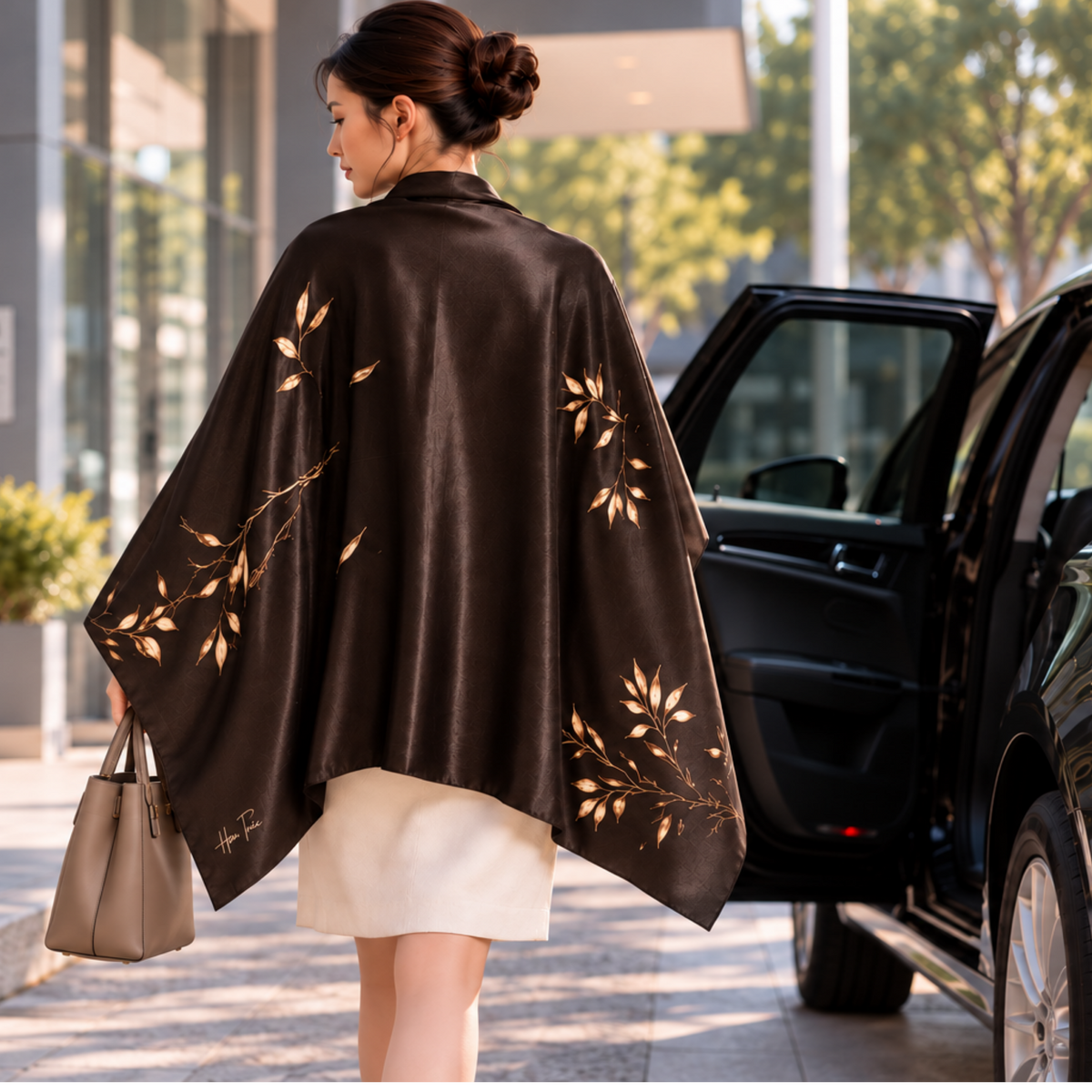
Its richness creates contrast without feeling severe. Paired with ivory or taupe, it feels warm and polished. With denim, camel, navy, or black, it becomes an easy grounding color.
That made espresso a natural choice for Resilience.
There is strength in the shade, but not rigidity. It has depth without demanding attention—a quality we wanted to carry through the collection.
While deep brown tones have existed in wardrobes for generations, espresso does not feel attached to a single fashion cycle.
Navy: Composed and Enduring
Few colors have remained as consistently wearable as navy.
It can be formal without feeling overly dressy, casual without feeling ordinary, and sophisticated without requiring much effort.
Navy works beautifully with white and ivory, but also with camel, gray, denim, burgundy, taupe, and warm metallic accents.
For Serenity, we chose a deep navy because of its sense of calm and composure.
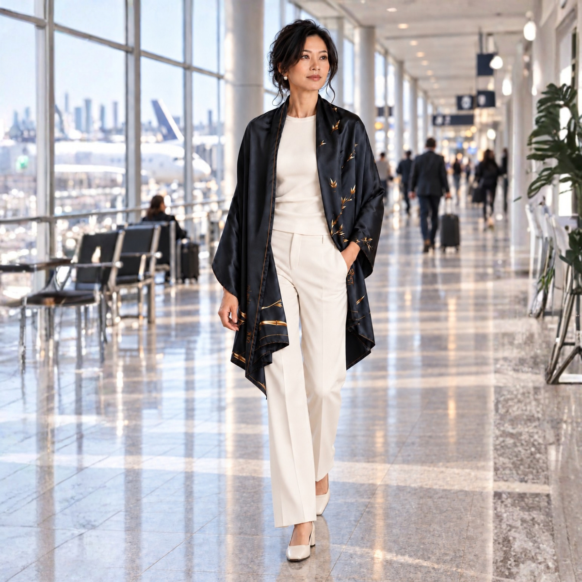
It is also an especially practical color for travel. A navy shawl can move easily from an airplane cabin to dinner, from an everyday layer to an evening accessory.
That ability to adapt is part of what makes navy enduring.
Burgundy: Richness Without Excess
Burgundy brings something different to the palette.
It offers color without becoming bright, and richness without becoming overly dramatic. Depending on how it is styled, burgundy can feel classic, modern, warm, or quietly expressive.
For someone who usually gravitates toward neutrals, it is also an approachable way to introduce color.
We chose burgundy for Renewal, but we were equally drawn to how naturally it works with the rest of the wardrobe.
It pairs beautifully with black, camel, ivory, navy, espresso, and taupe. It stands apart while still belonging.
That balance was important to us.
Four Colors Designed to Live Together
Although each color has its own identity, we never thought of the HanTrúc palette as four unrelated shades.
They were chosen to complement one another.
Taupe softens espresso. Espresso grounds taupe. Navy creates a natural counterpoint to burgundy. Burgundy brings warmth alongside navy.
Together, they create a palette that feels thoughtful without being overly coordinated.
As HanTrúc continues to evolve, that matters.
We want the colors introduced today to feel at home beside pieces created years from now across different materials, silhouettes, and uses.
A timeless palette creates that continuity.
Choosing Beyond the Trend Cycle
Fashion will always have a color of the season.
But the pieces we keep are often not the ones we bought because a certain shade happened to be everywhere at the time.
They are the pieces that continue to work.
The colors that still feel right years later.
The ones we can wear in different ways, in different places, and during different chapters of life.
That is what we wanted from the HanTrúc palette.
Taupe. Espresso. Navy. Burgundy.
Four distinct colors, chosen not simply for one collection or one season, but with the hope that they continue to feel relevant long after the moment they were introduced.
Intentional and enduring design begins with choices that are meant to last.